

¡Viva México!
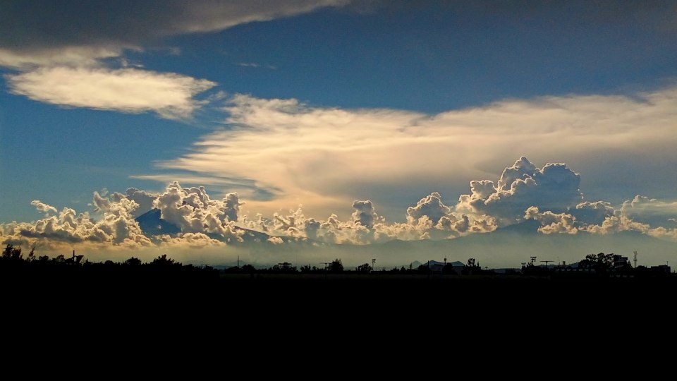
A view of the skyline where I live
Mexico is going really well for my daughter and myself. She is having a great time down here, making new friends at school.
I too am amking new friends and reestablishing connections with people who have been my friends for years.
The webpage font
I have made some minor revisions to the font I use for the webpage:
-
I have made the number “1” slightly taller so it doesn’t look shorter than other numbers
-
I have updated the italic “f” (e.g. f) to not have a long descender.
To update the italic “f”, I had to keep in mind that a number of ligatures with “f” in them exist, e.g. “ff”, “fi”, “fl”, “ffi”, “ffl”, among others. While one version of the font has all of “f”, “fi”, “fl”, “ffi”, and even “ffl” updated so that “f” doesn’t have a descender, it was simpler for me to make the italic “f” the non-italic “f” with a 10 degree oblique skew. Since the font I use on my webpage and blog is size optimized, I dealt with the ligatures by simply not having them; since Roboto Serif is essentially a slab serif which invokes typewriters of the 20th century, the font looks fine without ligatures.